Monday, 26 August 2013

Kenny K challenge - TTPHC

This weeks Through The Purple Haze blog challenge was funky boys and girls provided by the amazing NYC artist, Kenny K.

KennyK shop badge

I was given the funky skater boy image. I coloured him in using ProMarkers. I decided the character had to be bright and colourful to fit with the theme.


I used bright orange, spice and honeycomb for the t-shirt and sky blue, china blue and duck egg for the jeans.


I coloured the helmet in with apple, lime zest, pear green and moss.


The skateboard was coloured in with indigo blue, denim blue and china blue. The wheels with bright orange and honeycomb.


I matted the image on to light blue paper and chose a checkered green/blue background paper.

I die cut two Spellbinders tags and angled them, stamped the sentiment and inked around the edges with peeled paint distress ink.


I then added a length of silver ball chain to the edge and added a bronze corner brad at an angle.

This challenge was definitely the most difficult challenge I have ever done. 
I think, as many crafters do, boy or man cards are so difficult. As with a female card, loads of different embellishments can be added to decorate the card - flowers, ribbons, pearls, diamonds, etc.....
With a boy/mans card....... I'm stuck!!!

I really enjoyed colouring the image, but then I came to a complete halt. After a day of panic and rummaging through my mega room of stash, I found a few things that were appropriate. 

Kenny K is an amazing artist and this image was so cool to work with, but I think I may opt for funky girly image next time!


The Stamping Chef - Derby challenge

This was such a fun, cool challenge to participate in. The image was from The Stamping Chef Recipes Facebook group. 


This was a fantastic image to play with. I wanted to use a funky colour palette to work with to match the cheeky personality of the character.
I chose to colour in the image with ProMarkers using purples and electric blues.


I started with the hair. I used lavender, lilac and amethyst ProMarkers with a touch of slate. Then used the same colours for the skates.

I used duck egg, sky blue, cornflower and china blue for the character outfit, socks and helmet.

I wanted to colour in the skin with light colours to show the intensity of the characters hair and outfit.
I used ivory, vanilla, blush, dusky pink for the skin and poppy, coral and rose pink for the mouth.

I inked around the image Dusty Concord and Broken China Distress Inks. Then matted on to patterned purple paper then layered on to bright blue card. I then mounted it on to purple Core-dinations card.


I stamped the Kanban sentiment 'get ready to rock' on to the bright blue paper, matted it on to the purple core-dinations card and mounted it on purple glitter card.

I added a gold flourish circle with a purple resin rose and attached it to the top left. I tied a length of glitter ribbon to a gold heart charm and attached it using glue gel.


This was a wicked image to work with. I absolutely loved colouring this image. 
The last time I entered a challenge from The Stamping Chef I said I would be back, and here it is!!!

I think I am definitely hooked!!!

Wednesday, 21 August 2013

SHOWCASED ~ The Stamping Chef Facebook challenge

This week I entered The Stamping Chef Facebook challenge for the 1st time ever. The 'Lift Off!' Challenge.
I didn't win the challenge but my entry was showcased. Which means I was in the top 3 after the winner and my creation was put on The Stamping Chef Blog.

I am really chuffed seeing as this was my first entry to The Stamping Chef, I'm so chuffed in fact that I have already sent for the image for the next challenge!!!

Stay tuned......

Monday, 19 August 2013

'Dreaming' with Crafts and Me...

Well, I've been a member of the Design Team for Through The Purple Haze Challenges blog for just over two weeks now and I've got to say.... I'm lovin' it. 
Everyone on the team has been so supportive and the people who are entering their creations to the weekly challenges are absolutely amazing!! 

So... here is my second challenge.


This weeks challenge was an image called 'Dreaming' and was supplied by Crafts and Me.
When I saw this image I was very pleased as I am a huge fan of oldie-worldy black and white photographs. I had hundreds of ideas whirling in my head, I wanted to use flowers, dies, add a sentiment.... 

However, there was a twist to this weeks challenge. 

It was a 'bingo' challenge. 

The 'bingo' challenge consists of 9 squares, each square having a different craft item or embellishment. The idea is to choose 3 squares to make a line, as in 'bingo', and use the items on the project.

For this challenge, the 3 items from the 'bingo' line I had chosen to include was three papers, ribbon and pearls.


I wanted to stick to the colours in the photograph, black, white, grey and silver.

I started by raiding my ribbon jars - and trust me there are a few! Because of the delicacy of this image, I decided to use lace ribbons and stick to creams and whites. I had just bought some beautiful black organza ribbon a few days ago and decided this would be perfect for this project.


For the three papers, I chose a silver grey embossed paper, glossy black card and thick white embossed card. I matted and layered with the silver grey and the black with a 0.5cm edge, then layered it on to the white. 


I wanted to create a border using lines of the different lace ribbon. I started by sticking the black ribbon down the side creating ruffles every half centimeter but leaving a longer tail at the top and bottom of the page. 


I decided to do the same on the other side with the ruffles going horizontal rather than vertical. I cut lengths of lace and stuck each piece down, leaving a couple of gaps to add pearls.


I added a white organza ribbon bow in the bottom corner, added two pearl hat pins and a large silver pearl to the center. 


I used Kanban black and white pearls to finish the project. 

I loved taking part in this challenge, although it was difficult only being able to use 3 craft items/embellishments. 
But fortunately, the items I chose are definitely on my list of top ten crafty bits I love to use - black and white photographs, ribbons and pearls.

Thanks for looking.
Hope to see you all again soon. Toodle Pip.


** P.S. Are you an experienced crafter or just starting out?  Why don't you take a look at our blog and join in with our weekly challenges? Anybody can join in.
We have some fab prizes up for grabs. 
Just click on the Through The Purple Haze Challenges blog link at the top of my blog. 

Not a blogger???   
You can also join in on our Through The Purple Haze Challenges Facebook Group. Just click on the Facebook link at the top of my blog.

Hope to see you there. ** 


Sunday, 18 August 2013

The Stamping Chef Facebook challenge.

This weeks challenge on The Stamping Chef Recipes Facebook page (TSC Recipes) was 'Lift Off!'


They have a fabulous offer on the challenge image each week. It's free if you are playing along, for a 24 hour period then available in store at a lower price.

I decided my 'Lift Off!' rocket would be a girly rocket so I decided my colour palette would be pinks, purples and oranges.


I coloured in the image with Promarkers.

I added some dots with a quickie glue pen on the background to create stars and on the window of the rocket to create a glimmer, then sprinkled clear embossing powder over the top, waited for it to dry then heated it with a heat gun.


I inked the background with Broken China and Chipped Sapphire distress inks.


I stamped the sentiment 'Have A Blast!' with individual alphabet stamps and inked them with the same distress inks. 

I matted the image and the sentiment on to black gloss card then layered it on to blue glitter card.


This was the first challenge I had taken part in on The Stamping Chef Recipes Facebook Page. But, I think I will definitely be coming back again.

Thanks for looking.

Products used:
Promarkers - 
pastel pink
blossom
rose pink
dusky pink
coral
lavender
lilac
amethyst
honeycomb
cool grey 4
slate
sky blue
china blue
forest green
ruby red
poppy red
canary yellow
mustard

Distress Inks-
broken china
chipped sapphire

Quickie Glue pen
Clear embossing powder
Individual alphabet stamps
Archival jet black ink
Glue gel


Come on, join in.....

Are you an experienced crafter or just starting out?

Why don't you take a look at our blog and join in with our weekly challenges? Anybody can enter.
We have some fab prizes up for grabs.

Click on the link below to go to our blog. 

    http://www.throughthepurplehazechallenges.blogspot.co.uk/

Not a blogger???   
You can also join in at Through The Purple Haze Challenges Facebook Group. 

Click on the link below to go to our Facebook group.

        http://www.facebook.com/groups/throughthepurplehaze/

Hope to see you there. 

Go on.... have a go!!!

Wednesday, 14 August 2013

'New Home'

New Home card - April 2013


This is a card I created for my bestie, K and her family who was moving in to a new house.
I love, love, love the Art Houses stamp set from Creative Expressions - designed by Sam Poole. The are so funky and have so much detail, yet stamp so crisp.

My friend is a bit grungy, listens to weird music and well, is generally - different to the norm in every single way, but she is ace!!

I created this card with a grungy, distress feel, using torn papers and paint smudges.


I started by stamping the image using black Archival Ink on to Neenah Smooth card. When inking up the stamp, I missed areas to give it a aged, distress look. I tore around the edges of the image then inked the background with green ink.


I layered it on to a book page which I smudged with white paint, again, to create a distressed look. I then layered it on to a square of blue 'checked' paper. 

      I added the key and corner brads... 


           and added 3 paper roses. 


I inked the roses with gold ink then stamped the 'new' and 'home' with individual alphabet stamps using gold ink then black ink over the top. 
I then attached it to a Kraft card blank.


This is the kind of card I love to make, being able to get a bit inky and bring in the distress, aged look... Love it!

Hope you love it too. 
Thanks for looking.

Products used to make this card:
Sam Poole Art Houses stamp set
Neenah smooth card from Crafters Companion
Black Archival Ink
Green 'Ink it up!' ink pad
Gold 'Ink it up!' ink pad
Bronze corner brad
Silver key brad
Paper flowers
Book page
Background paper
Kraft card blank
Individual alphabet stamp set

Tuesday, 13 August 2013

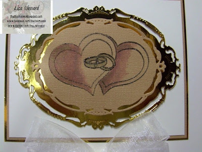
Rings & Hearts

Wedding card #2

This is another wedding card for my cousin M and his wife L which I made on request from my mum.

I love my Kanban wedding cake stamp (used on the previous post) but as both of these cards were intended for the same couple, I had to create something different. 

This is my creation.


I started with stamping the Kanban wedding rings stamp on to a piece of Crafters Companion Core-dinations gold/tan card. I created a mask and stamped a two hearts at either side of the rings.
I shaded the hearts using 'Ink it up!' red ink and the rings with 'Ink it up!' gold ink and a waterbrush.


I then cut the design out using a Spellbinders die and die cut the next size die up from the same Spellbinders set using gold mirror card.
I attached the gold/tan frame on to the mirror card using foam pads.
I attached it on to Neenah smooth white card then matted and layered on to the gold/tan textured card then gold mirror card. I put it on to an 8 X 8 card blank.


I stamped the sentiment on to white card (Neenah) and heat embossed it using 'Heat it up!' gold embossing powder. Again, matting and layering on to the gold/tan card and gold mirror card.

I tied a large double bow using white organza ribbon and attached it to the bottom center of the card, then added a gold heart gem.

I quite enjoyed making this card as I usually go straight for the Kanban wedding cake stamp, as it is so pretty. I decided to try something different with adding the ink using it as a painting medium. 

Hope you like it.... thanks for looking.

Products used to make this card:
Crafters Companion Core-dinations card and Neenah smooth card.
Gold mirror card
Ink it up! black, red and gold ink
Heat it up! gold embossing powder
White organza ribbon
Gold heart gem


Monday, 12 August 2013

Wedding cake

Wedding card - July 2013
This is a card I created for my cousin M and his wife L wedding in July 2013.


I started with embossing a piece of Crafters Companion Neenah smooth card and inking with distress inks.


I cut a frame out off a sheet of Kanban cream textured card using a Spellbinders die. 
I used the Kanban wedding cake stamp, stamped with clear embossing ink and heat embossed using gold 'Heat it up' powder. 
With the card having lots of texture, it made the embossing powder have extra dimension. 


I mounted the frame on to gold mirror card, which I sanded to give a more muted shine, using foam pads. 


I then mounted on to the embossed background. 
I matted it on to a piece of Crafters Companion Centura Pearl card and put it on to a 8 X 8 card blank.

I tied a knot in a length of organza ribbon and attached it at the bottom of the card.


I hope you like it.

To create this project I used:
Crafters Companion Centura Pearl card and Neenah smooth card.
Cuttlebug embossing folder and Cuttlebug
Spellbinders die
Kanban Cream textured card 
Kanban Wedding cake stamp
'Heat it up!' gold embossing powder
Gold Mirror card
Organza ribbon
'Ink it up!' Clear embossing ink
Sandpaper
8 X 8 card blank 
Glue

My 1st Design Team Challenge!!

My first challenge for Through The Purple Haze Challenges blog as a Design Team member is here!!!!

I have been so excited to post this on my blog but had to wait until the challenge launches on the TTPHC blog. 
So here it is, my first DT challenge.


I was so nervous to receive my first challenge but was pleased when I saw the beautiful image from Floppy Latte called 'flowers and butterflies'. 

I decided to use Pro Markers to colour the image choosing a colour palette of pinks, purples and greens.


I have been concentrating on my colouring skills over the past few months and think this challenge was perfect to express what I have learned. 

After colouring the image, I added a smidge of glitter on the butterfly wings (butterflies have to have some glitter don't they?)and on the center of the flower.


I matted and layered on to plain green card, leaf print paper and purple card then laid it flat on to a 8 X 8 card blank.

I added a bow made from green organza ribbon and placed a big button, then small button in the center.


I added a selection of different sizes and shades of green buttons to the top right hand corner to mirror the ones on the bow.


I really enjoyed creating my first challenge as a Design Team member for TTPHC team - they are a fantastic and helpful bunch. 
I hope you like it too, all your comments mean so much.


Thanks for looking - ta ta for now. 


Pro Markers: dusky rose, pastel pink, dusky pink and coral. Amethyst and lavender. Lime green, pear green and apple.
Card: Neenah smooth
Quick glue pen.
Glitter: My Craft Studio 
Ribbon and buttons: from my own stash.

Sunday, 11 August 2013

You have got to check out this blog for a mind field of inspiration
http://scrappellen.blogspot.no/


I have never seen anything like this before, some of her work is amazingly mesmerising. 
And she currently has a blog candy comp running. Beautiful..... 

Monday, 5 August 2013

   BLOG CANDY ALERT!!! BLOG CANDY ALERT!!!
Once we reach 100 followers, one lucky, lucky person will win all these goodies...


All you need to do to be in with a chance of winning is become a follower and copy this image in to your blog sidebar with a link to the challenge blog. 

Follow Through The Purple Haze Challenges Blog here.


Friday, 2 August 2013

With thanks flower tag

FLOWER TAG - FEBRUARY 2013

This is a tag I created for a friend to thank her after we had a lovely evening in.


I started by making the tag shape and covering it with pink floral paper. I stamped on to fancy parchment with clear embossing ink and heat embossed it with white embossing powder.


I made a flower from a Spellbinders die and fancy parchment and added a pearl bead to the center. 


I inked a mini tag and stamped the sentiment and tied it with a white ribbon and attached it under the flower.  


I added a lace trim in the center of the tag, added mini roses around the main flower and glued three pearl bead in the corner. 
I finished with colouring a length of white ribbon with a Promarker to match the floral background paper. 

This was a quick make tag but I think its extremely cute and very effected. 

Hope you like it as much as my friend did when she received it.