Monday, 16 September 2013

Through The Purple Haze Design Team - 'Bling it up!!!'

Hello all, this weeks Design Team challenge at Through The Purple Haze was sponsored by My Mums Craft Shop and the instructions were to 'bling it up!!'


It is SOOOOO NOT my cup of tea to be a bit bling, bling. 

I have a few crafting rules when it comes to adding bling to my creations. I may have been known to add a few pearls here and there on occasion, in a very minimal way. And mirror card.... mirror card is strictly for Christmas related projects. However, it can be used with everyday projects as long as it has been sanded and distressed to near death!!!

The design brief this week threw all my bling related crafting rules out the window! (But I must admit.... I had a blast creating this card!)

Here is my finished design.


I used one of the Moulin Divas - Tres Chic from Kanban and stamped it on to white card with black 'Ink it up!' ink. I then coloured in the image using ProMarkers. I wanted to use very simple and a minimum of colours as I knew the background and embellishments would be very wow, so wanted to keep the main image subtle.


After stamping and colouring the Moulin Diva, I cut around it using Labels Twenty-Nine Nestabilities Spellbinder die and inked around the edges with Pumice Stone Distress Ink.
I then covered the entire die cut image with 'Ink it up!' clear embossing ink and triple heat embossed it with 'Heat it up! clear embossing powder. This gave a real shimmer to the main image. 


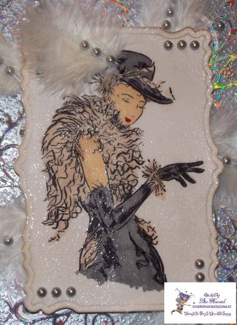
The next step was to add the bling... I started with some rainbow shimmer mirror card and cut out five of the background flourishes using the Spellinders D-Lites Fantastic Flourish One die. 


I decided to stick to grey/silver and white for my background papers. I chose a pearl white, silky, slightly textured paper for the 8 X 8 background and cut a 7 X 7 sheet of embossed silver/grey paper from the same paper pack for the matt. 


I added the Spellbinders Flourishes around the background and attached them flat to the card. I mounted the main image on to double foam pads and attached it to the center of the card.


I decided it needed something else to make the card more 'Tres Chic' and chose to add feathers. I tucked the ends of white feathers underneath the main image and added one on to the Divas hat.


I finished by adding silver matt pearls on the corners of the card, corners of the image, on the spines of the feathers and at points on the flourishes. (53 pearls in total added to this card - how's that for bling!!!)


This weeks design brief, to be honest, scared me a little bit. (As soon as I heard the phrase 'bling it up!' my brain automatically saw Jenny from the Block kitted out with 9" thick gold chains and dripping in diamonds!!!!)  
After recovering from the initial panic attack.... when I had (TIT) thought it through, I realised this could be a fun project without the tack.... and it was...... 

Hope you enjoyed this some-what different creation from me.... We all need to try something new once in a while.

Toodles for now - oh, please leave me a comment, I would love to hear your thoughts.


Ingredients:
* Kanban Moulin Divas - Tres Chic stamp set
* 'Ink it up! black ink
* White card
* ProMarkers - 
cool grey 4
slate
satin
ivory
poppy
* Spellbinders dies - 
Nestabilities Labels Twenty-Nine
* Spellbinders D-Lites Fantastic Flourish One
* Pumice Stone Distress Ink
* 'Ink it up!' clear embossing ink
* 'Heat it up!' clear embossing powder
* Rainbow shimmer card
* White feathers
* Silver matt pearls
* Background papers
* Adhesive

Monday, 9 September 2013

The Stamping Chef - 'Put a ring on it'

This weeks challenge over at The Stamping Chef was 'put a ring on it' A wedding theme image including a bride, some roses and huuggggeee diamond! 


Here is my finished design.


I started by colouring in the image with Promarkers. I started as I generally tend to do by colouring the hair and skin, if these two things arn't right, the whole image tends not to look right. 


I originally coloured the dress in with pink tones as I didn't want it to be white, along with the veil and gloves but then decided it needed something different. There is NO WAY this girl would wear a plain wedding dress. It needed something wow adding to it..... glitter!


I covered the whole of the dress, gloves and veil with a quickie glue pen and added My Craft Studio Extra Fine Crystal Glitter. It instantly made the dress stand out but not in a obvious over-the-top way.

I then coloured in the roses using Poppy, Ruby and Maroon. And Apple, Pear Green and Forest Green for the leaf in the center. 


I continued to colour in the ring and diamond and the crown.
I added a touch of glitter to the roses, ring and crown.

I wanted the main image to stand out so cut a oval frame from a Spellbinders die using rainbow shimmer card. 

I needed a sentiment on the card and wanted to use something different than... on you wedding day or congratulations. So chose "wishing you a day that sparkles" which I think is very in keeping with the dress.


I covered a 8 X 8 card blank with silvery white embossed paper, I inked around the edges of the sentiment with Victorian Velvet Distress ink and mounted the sentiment on to a smaller Spellbinders die cut rainbow shimmer frame with foam pads.
I attached the main image using foam pads to raise it from the frame. 
I then tided a quadrupled bow with a length of red satin edged organza ribbon and attached it above the sentiment. To finish I added three silver crystal gems to the top and bottom of the sentiment panel.


Ingredients: 
*Promarkers
apple, pear green, forest green, lime green, - leaf and the eyes. 
poppy, ruby, maroon - roses.
ivory, dusky pink, blush - skin.
buttercup, vanilla, mustard, sandstone - hair.
dusky pink, rose pink, blossom - dress, gloves and veil.
*Quick glue pen
*MCS extra fine crystal glitter
*foam pads
*card stock

I think this is my favourite completed card I have done from The Stamping Chef challenges so far. I think my colouring in this project is quite special, especially on the roses, as I was trying to work with tones rather than colour. 

Next weeks challenge at The Stamping Chef is going to be amazing. TSC is teaming up with Simply Betty Stamps again for a Halloween special - Vamps V's Cool Chicks.

I have already got my images and I'm ready to play, have you??? Check out The Stamping Chef blog for more info here.

Thanks for popping by, make my day and leave me a comment. Toodles.


I would like to submit this card in to the following challenges:

Glitter n Sparkle Challenge Blog - ADD A BOW http://glitternsparklechallengeblog.blogspot.co.uk/

Hobby Cutz Challenges - ANYTHING GOES http://hobbycutzchallenges.blogspot.co.uk/

One Stitch At A Time - CHALLENGE #180 USE A DIGI http://onestitchatatimechallenge.blogspot.co.uk/

Through The Purple Haze Challenges - Penny Black sponsored sketch challenge.

This weeks challenge on the TTPHC blog was a sketch,

and was sponsored by the wonderful Penny Black.

For those who are unaware - a sketch is a simple outline drawing to show where the main image, embellishments, sentiment etc should be placed on the card. The sketch can be rotated or mirrored to add interest or look balanced on the card blank depending on the size you have chosen to work on.


This is the sketch we were provided with.


Here is the card I created interpreted from the sketch. 


I decided to use the same shapes throughout the card but wanted to use an unusual shape rather than squares or circles. I decided to use the decagon dies from Spellbinders. 

I chose to work with a Kanban stamp set which I adore and chose a beige, brown and cream colour theme.


I stamped the image of the dress on to white card and heat embossed it using clear embossing powder. I cut it out using the biggest of the decagon dies. 


I stamped two of each of the crown#1 stamp, crown#2 stamp and the clothing hanger stamp and again heat embossed it with clear embossing powder.


I coloured the images in with Promarkers using Caramel, Mustard, Henna and cinnamon.

I cut out a 6 inch circle using the EK Success Circle Scissor Pro. (A-MAZ-ING tool, fabulous to use and cuts the most intricate circles, fantastic.....) 
I embossed it using the grid mask from Stamps Away, inked it with Pumice Stone and Old Paper Distress Inks, placed the mask back on to the circle, then inked it with clear ink and heat embossed it using clear embossing powder. 


I cut lengths of different types of ribbon and coloured each one with a Promarker from the colour palette I had chosen.

I then followed the sketch to put the elements together, adding height to the different pieces using foam pads. 

I wanted my version of the sketch to be different as we have all done a sample with the same sketch on the team. I wanted to keep in neutral but add a gleam with the embossing powders.

I hope you like my take on this weeks challenge. 

Thanks for popping by. Toodles. 

Sunday, 8 September 2013

PaperArtsy #3Up Challenge - PART 2

Hello again, here is the next installment of the PaperArtsy #3Up Challenge I participated in. As I mentioned on my last post, Leandra (PaperArtsy Owner) requested one project for the challenge, but as the products I received to do this challenge were so scrummy, I got carried away!!!
I did four projects in total - here is project number two!


 I stamped the large flower stamp from the Hot Pick 1011 stamp set six times on to white neenah smooth card.


I coloured each flower head with Dusty Concord Distress Ink using a waterbrush and then coloured the center of the flower heads and stalks of two of the flowers with Crushed Olive and Peeled Paint Distress Inks using a waterbrush.


I cut out four of the flower heads and cut two of the complete flower stamp with stalk. I then layered them on top of each other using foam pads in between each layer to create a decoupage flower.


I stamped three of the butterfly stamps (from the Hot Pick 1004 stamp set) on to clear shrink plastic with black Stazon ink.


I cut them out then heated them with a heat gun until they shrunk.


I attached the decoupage flower to cream/beige printed card. Then matted it on to textured cream card and layered it on to purple floral card, then purple glitter card.


I attached the three butterflies with glue gel to allow them to stand from the card.


I really enjoyed doing this project although it is a different crafty angle from my usual style. I loved using this individual stamp and thought I'd try something different than flat stamping.

Leave me a comment - all comments are kindly received. Toodles for now.


I would like to enter this card in to the following challenges:

challenge 200 @ http://totallygorjuss.blogspot.co.uk/ Anything Goes

Inspire Me Friday's @ http://asimplefive.blogspot.co.uk/ Anything Goes

Friday challenge @ http://www.blogquickquotes.com Anything Goes

Challenge #23 @ http://sisteractcardchallenge.blogspot.co.uk/  Anything Goes

Challenge #36 @ http://avenue613.blogspot.co.uk/ Anything Goes


Thursday, 5 September 2013

PaperArtsy #3Up Challenge.

wow, wow, wow!!!! I am soooooo pleased to blog this as it means so much to me. This is probably one of the best things I have taken
part in during my crafting days. 

Being able to work with such a massive company as PaperArtsy.... I feel so privileged to have taken part and to work with some fantastic products and people.

How it all came about I hear you say..... 
A few weeks ago, I saw a post on facebook from Leandra at PaperArtsy saying there were places still available for the #3Up Challenge, sign up via twitter..... (I don't usually tweet, I'm more of a facebooker) But, being such a massive fan of PaperArtsy I just couldn't pass this opportunity up. I logged on to twitter and contacted Leandra (who is probable one of the most loveliest people I have ever 'met') and she signed me up. The Challenge would be posted on the PaperArtsy blog when completed. 

A few days later, the most wonderful package arrived on my door step. Inside were some 
a-ma-zing goodies. Stamps, ribbons, beads, all from PaperArtsy, along with a little box - weird? yes! I thought mmmm. 
After reading a little note from Leandra, it stated we needed to use the substrate provided in the package. 
Inside, was also a colour strip with the colours we could use. On my colour strip was a buttery, creamy, yellowly beige, a lovely lilacy purple and a gorgeous minty lime green. I love purple and lime, so I was well chuffed about that too. I thought this can't get any better.... It did!....

I was so giddy, I just couldn't wait to get started. I love PaperArtsy products, particularly their stamps, the variety is so varied but so detailed. I received two sets of stamps in the package.

Hot Pick 1004 stamp set


Hot Pick 1011 stamp set


I started playing with the stamps and a hundred and one ideas started floating around my head, oh I can do this, oh look at that, oh I wana do this....

I decided to look on the PaperArtsy website to see what else was available. 
I have heard some fab raves from a friend (Lou) about the PaperArtsy Fresco Finish Chalk Acrylic Paints and decided to purchase some in my chosen colour palette. 

I got Haystack, Limelight and Pansy along with the Gloss Glaze and Crackle Glaze. (Couldn't resist!) 


The next step, raid the craft room!
I dug out everything I had that was cream/yellow, purple and limy green. 

And got to work..... Leandra asked for one project, but I just couldn't stop once I got started. I did four projects in total.

Here is project #1
Frame.


This was an old picture frame which I striped and sanded. Firstly, I painted it with PaperArtsy Fresco Finish Chalk Acrylic Limelight paint then painted over the top with PaperArtsy Fresco Finish Crackle Glaze. After it dried, I painted over the top with PaperArtsy Fresco Finish Pansy paint, dried it and watched the paint crackle!


To create the background on the inside of the frame, I smeared a line of the Pansy paint down a green textured piece of card and cut it to fit in the frame with a border.


For the frame image, I put four microscope slides at different edges of the frame and stamped the birdcage image (from the Hot Pick 1004 stamp set) using Stazon black ink, making sure the stamp was touching all the slides. I attached the slides on to the background card then attached two antique gold corner flourishes to opposite corners.


For the frame, I stamped the smaller of the cog flower designs (from the Hot Pick 1004 stamp set) eight times to make two flowers and stamped the large cog flower design four times to make a larger single flower. I added a piece of PaperArtsy purple ribbon which I folded in half and stuck in the centre of each flower.


I then die cut some flowers using a Spellbinders die in different coloured paper, I randomly stamped the cream flowers using ‘the bluebird carries the sky on his back’ stamp (from the Hot Pick 1004 stamp set) and added blue and green seed beads to the centers. 


I randomly stamped the green flower using the target stamp (from the Hot Pick 1004 stamp set). I made up the flowers and added a piece of folded ribbon to the center.


I stamped the two leaf designs (from the Hot Pick 1004 stamp set) on to the same green textured card I used for the background. Cut them out, shaped them then added them to the flowers.


I tied a piece of different ribbon around the top of three antique bronze birdcages and attached them to the frame. 


This is project #1! I could have gone on fooorrrrrevvvvvvvveeeeerrrrrr!!!!!

I will be posting the other project ASAP but check out the PaperArtsy Blog to see all the other Hot Pick #3Up Challenge entries. 

Toodles for now. 

WOOOOO  HOOOOOOO ssoooooooo CHUFFED!!!!

Sunday, 1 September 2013

The Stamping Chef - 'Good Girl' challenge.

This weeks challenge on The Stamping Chef recipies Facebook page was the fabulous image titled 'Good Girl' which I think this girl is anything but!.... 
As we all know, these are cheeky and fun images from TSC. 
Have a look at the blog..... 


It was another cool image from TSC which I really enjoyed colouring and creating a bright matching background for.


I started colouring the image with ProMarkers, using bright orange, honeycomb and cinnamon for the hair. 


I wanted the 'good girl' to have a bright outfit so decided on a clash of red and blue. I used poppy and ruby for the boots and top with a hint of maroon, and ruby with cool grey 4 for the glasses. I used duck egg, sky blue and cornflower for the skirt and braces. 


To colour the skin, I used ivory, blush, dusky pink and coral along with rose pink, ruby and pastel pink for the tattoos. 

I cut round the image and mounted it on blue texture-printed card with glue gel so it stood from the page. I then layered it on to some orange sparkly glossy card then on to orange textured card. I layered it on to a piece of cupcake scribble paper to mirror the tattoos on the image.


I stamped the sentiment using individual alphabet stamps in a random style to add a bit of a rebel feel. I then stamped a cupcake and bow on either side of the sentiment to reflect the paper and tattoos on the image. I inked around the edges with victorian velvet distress ink. 
I punched out two flowers in light blue textured card and two in dark blue textured card, layered them then attached a sparkly orange brad in the centre.


Again, and I have said this every week after a challenge from TSC, I loved doing this challenge. I think my colouring skills are really coming along and my confidence with my colouring is definitely growing and I believe it is due to these fabulous images from TSC. 

I will be there again next week!!


Thanks for looking. Any comments gratefully received. 

Toodle pip.